Jessie Moore has been writing professionally for nearly two decades; for the past seven years, she's focused on writing, ghostwriting, and editing in the finance space. She is a Today Show and Publisher's Weekly-featured author who has written or ghostwritten 10+ books on a wide variety of topics, ranging from day trading to unicorns to plant care.
Traders don’t have crystal balls. Stock chart patterns are the next best thing.
Stock chart patterns (or crypto chart patterns) help traders gain insight into potential price trends, whether up or down.
They are identifiable patterns in trading based on past price movements that produce trendlines revealing possible future moves. This approach is predominantly used in the charting and technical analysis space.
Unlike crystal balls, different stock chart patterns are based on proven track records.
While there are many different stock chart patterns, they are all used to help predict the direction of asset prices.
In this article, I’ll teach you all about stock chart patterns — we’ll start with an education on the basics of stock charts and then progress to 14 chart patterns every trader should know.
The best charting app/broker combo…
If you’re looking for a stock charting app, there’s a good chance that you’re also looking for a broker. TradeStation has the best free charting software on the market – and if its proprietary charts aren’t enough for you, it integrates fully with TradingView! That means you can use TradeStation for your broker and make trades directly from a TradingView chart.
But TradeStation’s in-house charts shouldn’t be overlooked. Its custom-built tools include:
- Chart Analysis – a multi-function window where you can look up price data, perform technical analysis, back-test and automate strategies, and show orders and positions
- RadarScreen – one of the most specced-out stock screeners available, featuring alerts and real-time watchlists with 329 criteria built in
- Matrix – this takes all of the tools typically featured alongside charts (a market depth window, buy and sell signals, and an order-entry tool) and puts them into one window
Sign up for TradeStation here.
The 3 Types of Stock Charts
We’ve all seen it. Often in a Hollywood movie. Two, three, and even four-plus monitor workstations. Charts and numbers saturate the screens, refreshing every second. When you see this, you’re likely looking at charting and technical analysis in action.
While these charts can look intimidating to the uninitiated, they are much more accessible than you might think, even for beginners. Let’s break it down:
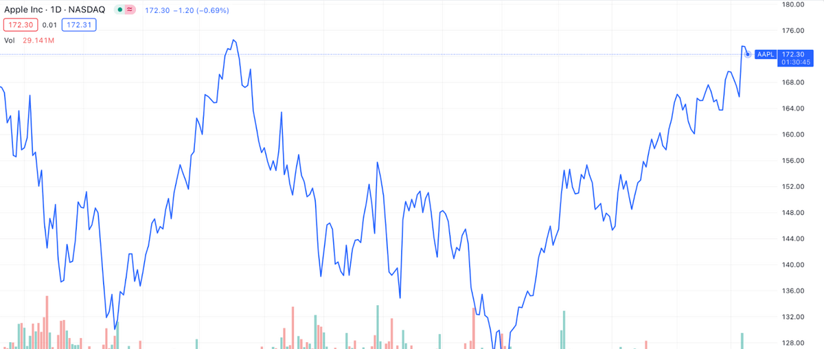
1. Line Chart
When you Google a security like Apple (NASDAQ: AAPL), you’re likely to see a line chart pop up. It’s the chart everyone and their grandma is familiar with. It’s a simple representation of the price movement of a security through time.
A stock’s price is plotted on a chart at consistent increments and connected by straight lines. Typically, line charts use daily stock close prices.
While broad trends can be observed, line charts don’t necessarily provide much insight into patterns or trends.
2. Bar Chart
Bar charts bring more to the table than line charts. Like line charts, different increments can be used. With bar charts, however, you can see each period’s open, high, low, and close (OHLC). Bar chars do this by displaying a vertical line.
The line spans the entire price movement for the day, from the low to the high. In addition, the open and close prices are also marked, which may or may not coincide with the day’s high or low.
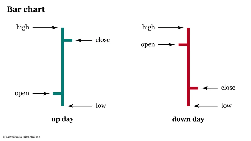
Just like with line charts, as you zoom out, you begin to see the price action move through time.
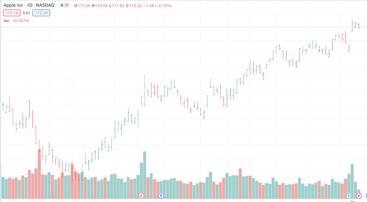
3. Candlestick Chart
Serious traders favor candlestick charts, which are so named because they look like a candle with a wick protruding from both sides.
Candlestick charts are similar to bar charts but go even further.
Like bar charts, candlestick charts display the open, high, low, and close (OHLC) price. However, the body of a candlestick also shows information:
- White or green body: the close price is higher than the open price.
- Black or red body: the close price is lower than the open price.
- Horizontal line: the close price is unchanged from the open price.
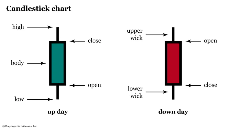
Insight into how a stock closed relative to its open price can offer unique insight into the sentiment of the security.
For example, consecutive days of red or black (i.e., the stock closed lower than it opened for multiple days in a row) might imply a bearish sentiment.
Alternatively, imagine a stock displaying green or white candlesticks for five days. In other words, the stock closed higher each consecutive day for five days. This could imply a bullish sentiment.
It’s not just about charts…
Stock moves don’t exist in a vacuum — they go hand in hand with the news cycle. Benzinga Pro provides an invaluable newsfeed that’s ideal for day traders due to its real-time newsfeed, audio squawk for live updates, and customizable stock screener that identifies trading opportunities.
Additionally, the platform’s Movers Tool highlights stocks with significant price changes, while real-time alerts on price spikes and unusual activity help you make informed decisions. Get started for FREE using the link below.
14 Trading Chart Patterns:
Below are some of the most popular and trusted stock chart patterns traders leverage today. For each stock chart pattern, I’ve highlighted what direction they are used to confirm (i.e., bullish or bearish) and what type of pattern they are considered.
As a refresher, here are the terms I’ll use to describe the various patterns in trading.
- Support Line: the price level at which a downtrend is expected to stop (bottom out) because of growing buyer demand.
- Resistance Line: the price level at which an uptrend is expected to stop (peak) because of growing seller supply.
- Neckline: another word often used in place of ‘support line’ or ‘resistance line.’
- Breakout: when a security’s price moves (“breaks out”) above a resistance line or moves below a support line.
- Continuation: A continuation pattern tells a trader that a price trend will likely persist.
- Reversal: A reversal pattern tells a trader that a price trend will likely reverse.
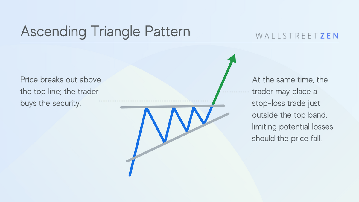
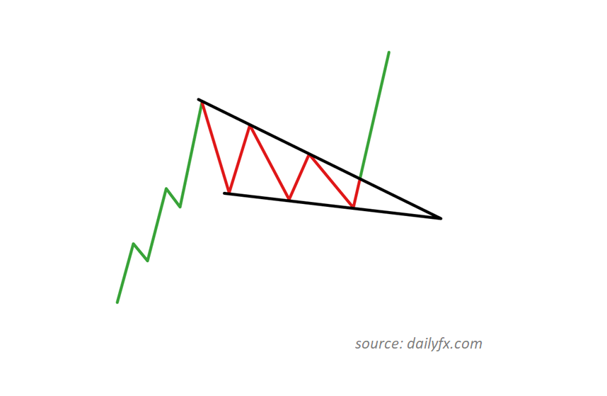
1. Ascending Triangle
Direction: Bullish
Type: Breakout, Continuation
Ascending triangle trading chart patterns are some of the most widely used stock market patterns. They are considered bullish chart patterns that reveal to a trader that a breakout is likely to occur at the point where the triangle lines converge.
The pattern forms as a stock repeatedly peaks at the resistance line, with increasingly higher lows.
Over time, the price ranges the stock trades in narrows until the lines converge, indicating a breakout above the resistance line is likely to occur.

Want to know more about the ascending triangle pattern? Check out this article.
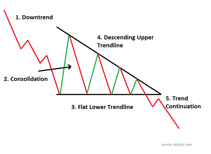
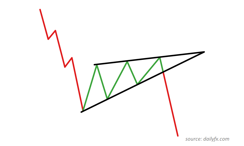
2. Descending Triangle
Direction: Bearish
Type: Breakout, Continuation
In contrast to chart patterns like the bullish ascending triangle, descending triangle stock market patterns are the bullish inverse. The stock’s price repeatedly bottoms out at the support line, with increasingly lower highs until the lines converge, implying a breakout below the support line is likely.

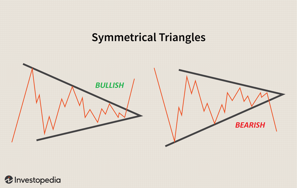
3. Symmetrical Triangle
Direction: Bullish or Bearish
Type: Breakout, Continuation
Symmetrical triangle patterns are like ascending and descending triangles, but with one line sloping down and one line sloping up at roughly the equivalent angle.
- The signal is bullish if the stock price breaks out above the support line from below.
- The signal is bearish if the stock price breaks out below the resistance line from above.
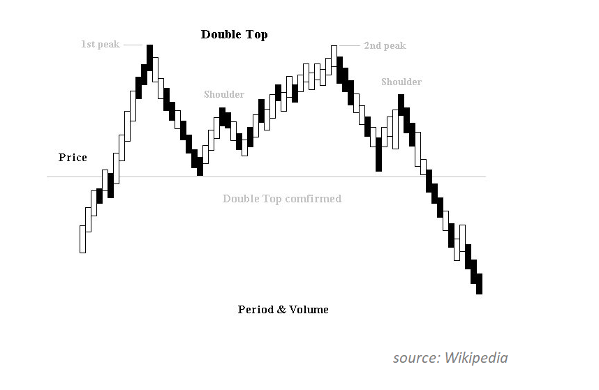
4. Double-Top
Direction: Bearish
Type: Breakout, Continuation
A double-top is an easily identifiable charting pattern as it looks like a capital ‘M.’ After the asset price peaks twice at roughly the same price (the two peaks of the ‘M’), the assumption is that the price will fall, break through the below support line, and continue to fall further.
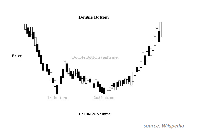
5. Double-Bottom
Direction: Bullish
Type: Breakout, Continuation
A double-bottom is the opposite of a double-top. This pattern is similarly easy to identify, resembling a capital ‘W.’
After the asset price bottoms out twice at roughly the same price (the troughs of the letter ‘W’), the assumption is that the price will rise and break through the below resistance line and continue to appreciate further.
The triple bottom pattern is more rare, but it’s one of the most bullish chart formations.
Crucial resources for traders
Tools
- Best charting software: TradingView Pro+
- Best trading computer: Radical X13 EZ Trading Computer
Brokers
- Best for beginners: eToro*
- Best for advanced traders: Tradestation
Education
- Best overall day trading course: Investors Underground
- Real-time news: Benzinga Pro
eToro securities trading is offered by eToro USA Securities, Inc. (“the BD”), member of FINRA and SIPC. Cryptocurrency is offered by eToro USA LLC (“the MSB”) (NMLS: 1769299) and is not FDIC or SIPC insured. Investing involves risk, and content is provided for educational purposes only, does not imply a recommendation, and is not a guarantee of future performance. https://www.wallstreetzen.com is not an affiliate and may be compensated if you access certain products or services offered by the MSB and/or the BD.
eToro is a multi-asset investment platform. The value of your investments may go up or down. Your capital is at risk.
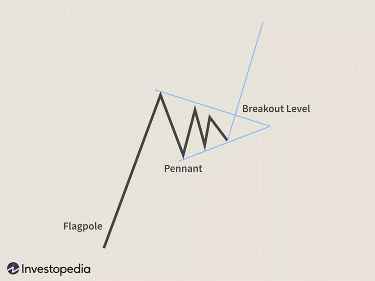
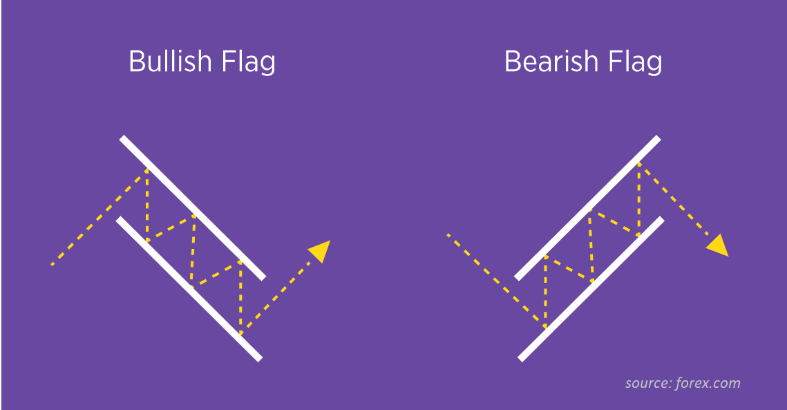
6. Pennant
Direction: Bullish or Bearish
Type: Breakout, Continuation
A pennant is a type of continuation pattern named such because it resembles a tapering flag, similar to the ones you might find flying on a ship at half-mast.
- A bullish pennant forms when an asset’s price experiences a significant upward move (the flagpole). The asset then experiences a period of consolidation with converging trend lines (the pennant). Lastly, the breakout occurs in the same direction as the initial rapid price appreciation (the second half of the flagpole).
- A bullish pennant forms when an asset’s price experiences a sizable downward move (the flagpole). The asset then experiences a period of consolidation with converging trend lines (the pennant). Lastly, the breakout occurs in the same direction as the initial rapid price appreciation (the second half of the flagpole).
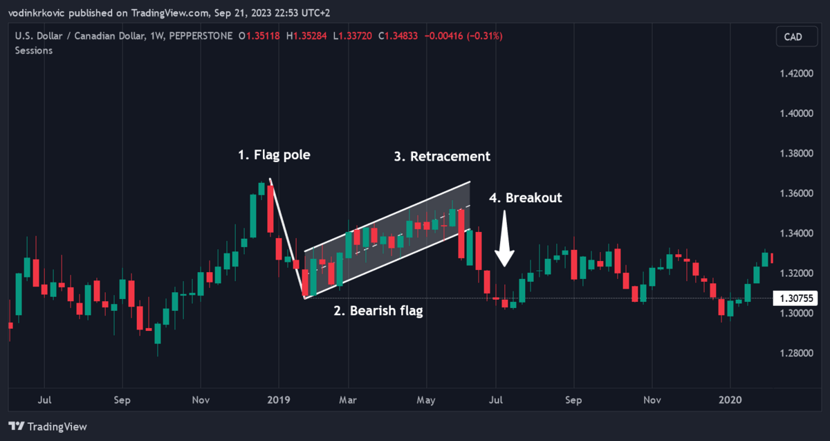
7. Flag
Direction: Bullish or Bearish
Type: Breakout, Continuation
The flag pattern is similar to the pennant pattern, the only difference being the consolidation phase. Whereas with a pennant, the trend lines converge, with a flag, the trend lines remain parallel.
Like a pennant pattern, flag patterns can be either bullish or bearish.
8. Wedge
Direction: Bullish or Bearish
Type: Breakout, Reversal
A wedge pattern is similar to an ascending or descending triangle. The only difference is that with ascending and descending triangles, the respective resistance and support lines are horizontal. With a wedge, the resistance and support lines are sloped.
- A rising wedge is considered bearish. It implies that a stock has been appreciating and is approaching a reversal.
- A falling wedge is considered bullish. It implies that a falling stock will likely reverse course and appreciate in value.
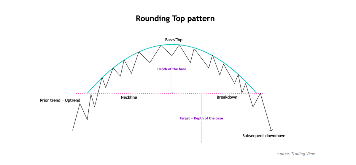
9. Rounding Top
Direction: Bearish
Type: Breakout, Continuation
A rounding top is typically considered a bearish signal. In this pattern, an asset’s price forms a dome (or an upside-down capital ‘U’) before breaking out from above the support line and dropping further.
10. Rounding Bottom
Direction: Bullish
Type: Breakout, Continuation
A rounding bottom is typically considered a bullish signal. An asset’s price forms a rounded trough (a capital ‘U’) before breaking out from below the resistance line and further appreciating.
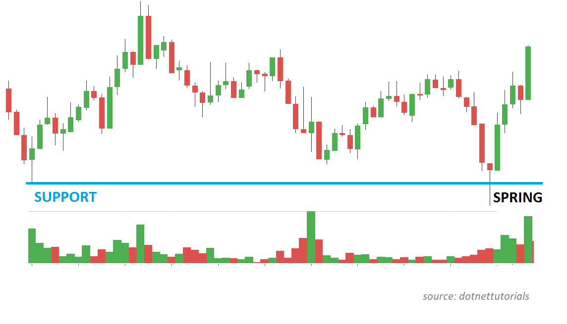
11. The Spring
Direction: Bullish
Type: Reversal
A spring forms when an asset’s price moves below the support level but then rapidly reverses and moves back into the trading range.
This is sometimes called a ‘bear trap’ since it looks like a stock might experience a large drop in price, but it doesn’t subsequently materialize.
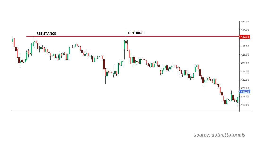
12. The Upthrust
Direction: Bearish
Type: Reversal
An upthrust is the opposite of a spring charting pattern. It occurs when the stock price moves above the resistance line but quickly reverses into the recent trading range. As a result, this is often termed a ‘bull trap’ since it appears like the asset price is set to appreciate.
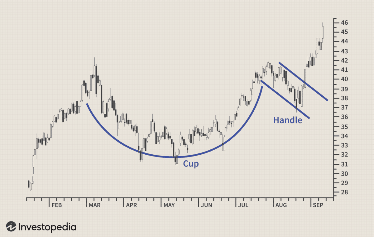
13. Cup and Handle
Direction: Bullish
Type: Breakout, Continuation
A cup and handle is a continuation charting pattern that implies a stock is likely to form a bullish trend.
It’s similar to a rounding bottom pattern, but it includes the addition of what resembles a coffee mug handle.
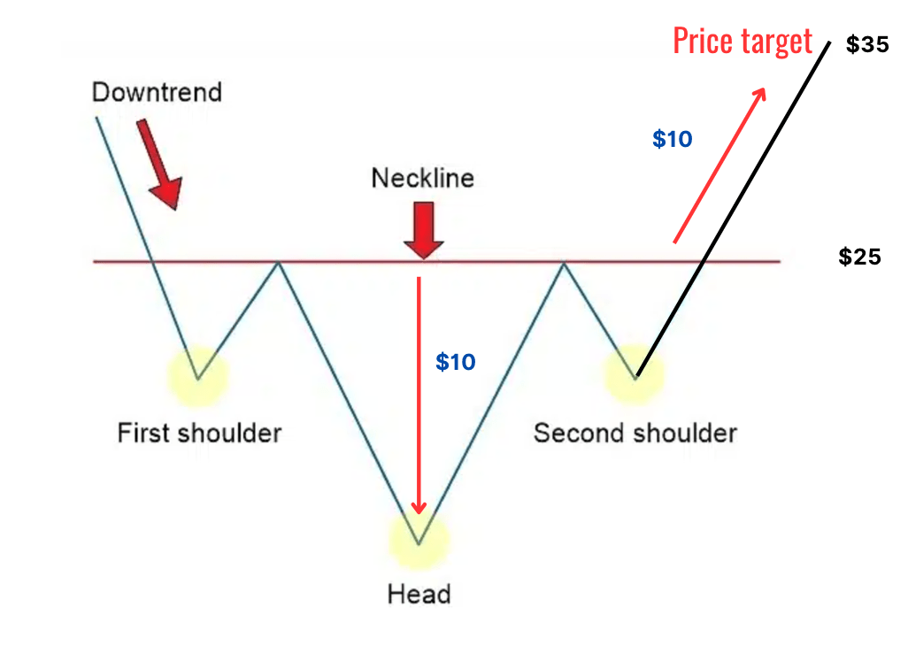
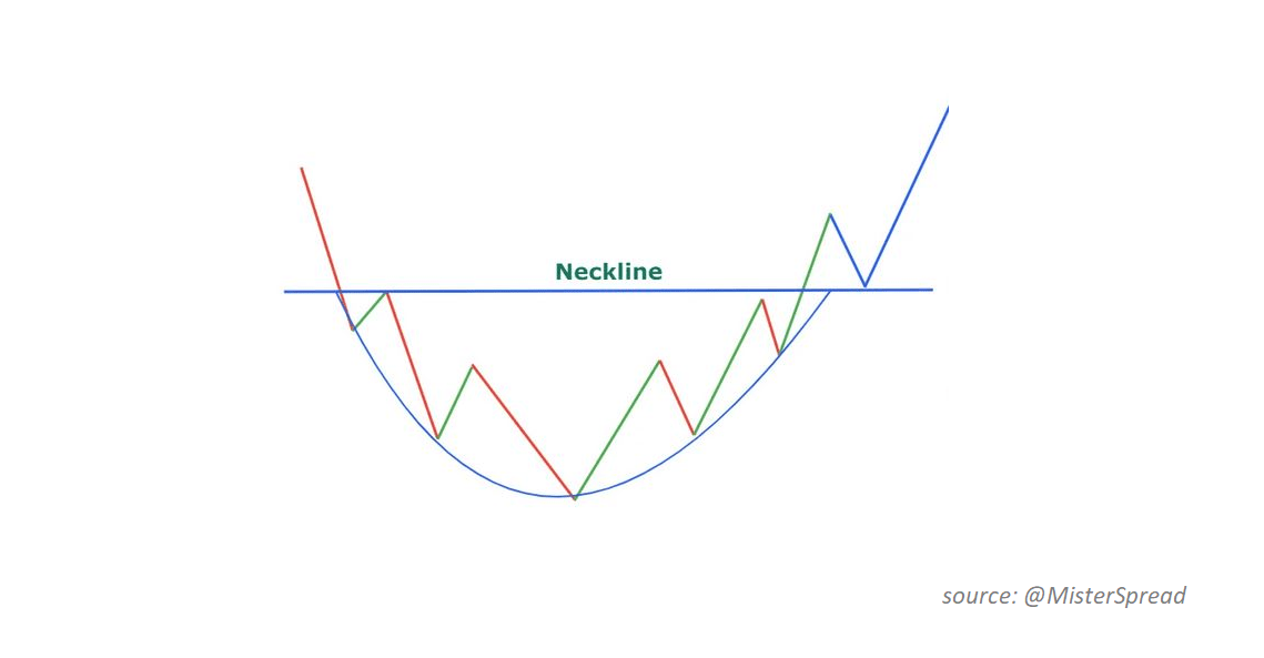
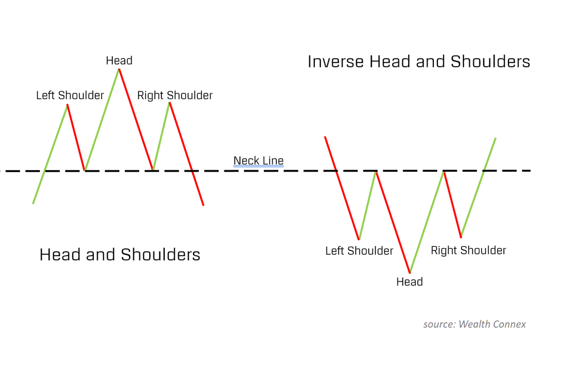
14. Head and Shoulders
Direction: Bullish or Bearish
Type: Breakout, Reversal
The head and shoulders pattern is named as such because the three peaks resemble two shoulders straddling a higher ‘head.’
After forming the three peaks, the stock is expected to fall further if it breaches the support line (or neckline) from above.
Alternatively, an inverse head and shoulders is the opposite and can indicate a bullish trend when the resistance line (or neckline) is crossed from below.
How to Confirm Trading Chart Patterns
Stock Market Guides helps traders find specific stock setups with a backtested edge by pairing technical signals with historical performance data. Each scan shows how similar setups have performed in the past, making it easier to filter for high-probability trades with confidence.
A trading chart pattern can be confirmed once it fulfills the requirements of that particular pattern, including, for example, breaching a support or resistance line.
For example, take the following pennant chart pattern. The pennant would not be considered “confirmed” until the stock’s price breaks above the top resistance line and forms the flagpole’s top.
Of course, some traders may enter a trader before a pattern is confirmed. This may help generate a more profitable trade, but it may come at the expense of less prediction accuracy.
That is, just because a pennant chart pattern appears to be forming doesn’t mean it necessarily will. Confirmation is simply a reflection of historical precedents.
After all, these charting patterns have been used countless times by traders before us. These traders have made observations that have led to these patterns developing their reputation. If a pattern is confirmed, you can expect a particular price action based on the observations of those that came before us.
When patterns aren’t confirmed, the odds of an accurate prediction are lower.
Regardless, while no pattern is perfect, they can offer general signals that can help improve trading.
As a result, prudent traders don’t necessarily rely on a single indicator or signal. Instead, they attempt to verify trends using numerous tools.
Moreover, most traders will want multiple days of data before confirming any trend.
Perhaps the most important part of chart pattern trading is obtaining experience. Over time, traders begin to improve at identifying patterns. This is especially true for those that stick to similar industries or stocks where they get exposure to the same assets repeatedly.
Experience in a particular sector, for example, arms traders with knowledge about typical price action, volume, etc. These signals can be combined with charting patterns to further cement conviction.
The best way to learn and gain experience at the same time? Investors Underground.
Investors Underground offers one of the most complete trading ecourses out there.
It’s led by Nathan Michaud, a world-class trader and educator, who has built an impressive collection of stock trading courses and resources.
As a member, you get access to 1000+ videos, pre-market broadcasts, trade recaps, and IU’s Live Trading Floor. IU also has a Trading Encyclopedia to teach new traders the basics of trading.
Final Word: Stock Chart Patterns
To the uninitiated, stock chart patterns can seem daunting. Hollywood portrayals don’t necessarily help — desk setups with five monitors may look intimidating. But it doesn’t have to be that way.
While these patterns do not guarantee future price movements, they can offer traders an additional edge to help increase the likelihood of successful trades and improve profitability.
The more you leverage these charting patterns, the more valuable they will become. While understanding the theory is essential, nothing can replace the wisdom gained by working with these patterns directly. Check out the best stock charting software to get started.
FAQs:
What is the most profitable chart pattern?
The Heat & Shoulders pattern is often considered the most profitable trading chart pattern.
What is the most reliable stock pattern?
The Head & Shoulders pattern is considered the most reliable stock pattern, believed to have an 89% success rate.
What are the 3 types of stock charts?
The 3 main types of stock charts are:
Line charts
Bar charts
Candlestick charts
Do stock chart patterns work?
Yes, stock chart patterns work, but they are not infallible. Head & shoulders chart patterns, for example, are believed to provide accurate direction the majority of the time. However, there are no guarantees.
Where to Invest $1,000 Right Now?
Did you know that stocks rated as "Buy" by the Top Analysts in WallStreetZen's database beat the S&P500 by 98.4% last year?
Our April report reveals the 3 "Strong Buy" stocks that market-beating analysts predict will outperform over the next year.